Brand Design for Thriving Nottingham
Project Overview
Client: Thriving Nottingham
Industry: Health and Wellbeing
Project Duration: 2 Months
Software Used: InDesign, Figma, Illustrator
Industry: Health and Wellbeing
Project Duration: 2 Months
Software Used: InDesign, Figma, Illustrator
Introduction
Thriving Nottingham is a newly established health and wellbeing service that offers support in weight loss, smoking cessation, and physical activity. The goal of this project was to create a distinct and engaging brand identity that effectively communicates the organisation’s mission of improving public health through accessible and inclusive services.
Project Scope
The branding process involved:
Logo Design: Crafting a unique and recognisable logo that reflects the organisation’s mission and values.
Colour Palette Development: Establishing a cohesive colour scheme that conveys energy, positivity, and trust.
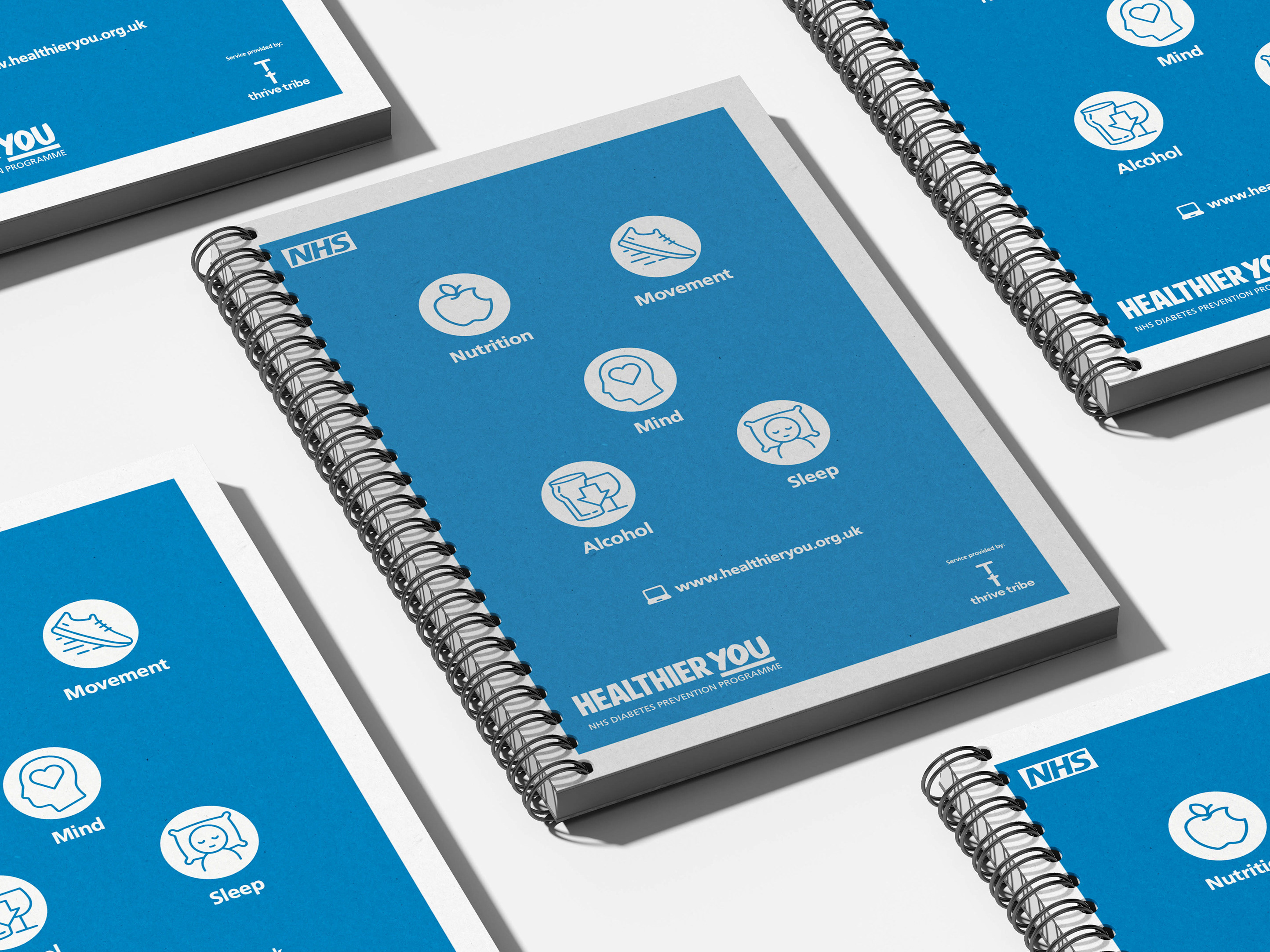
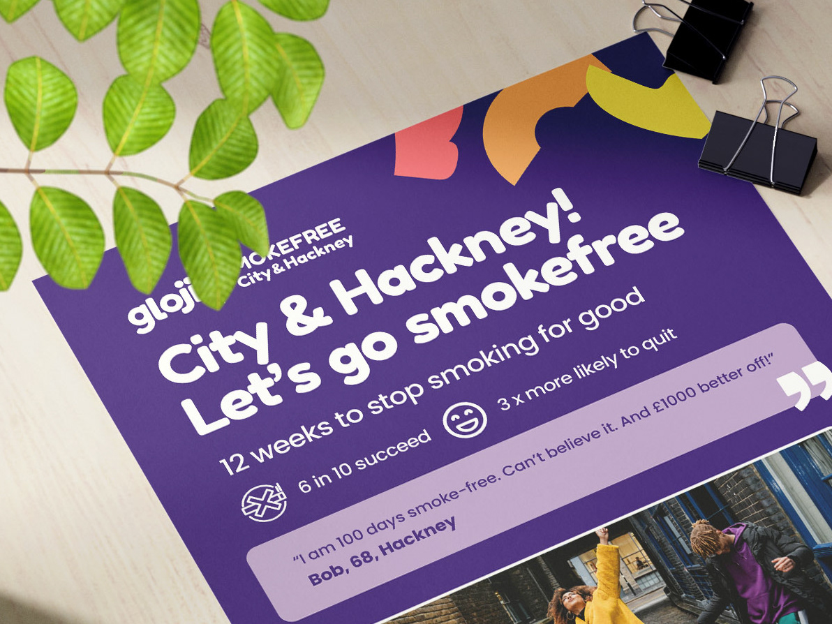
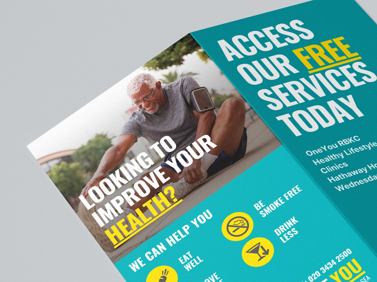
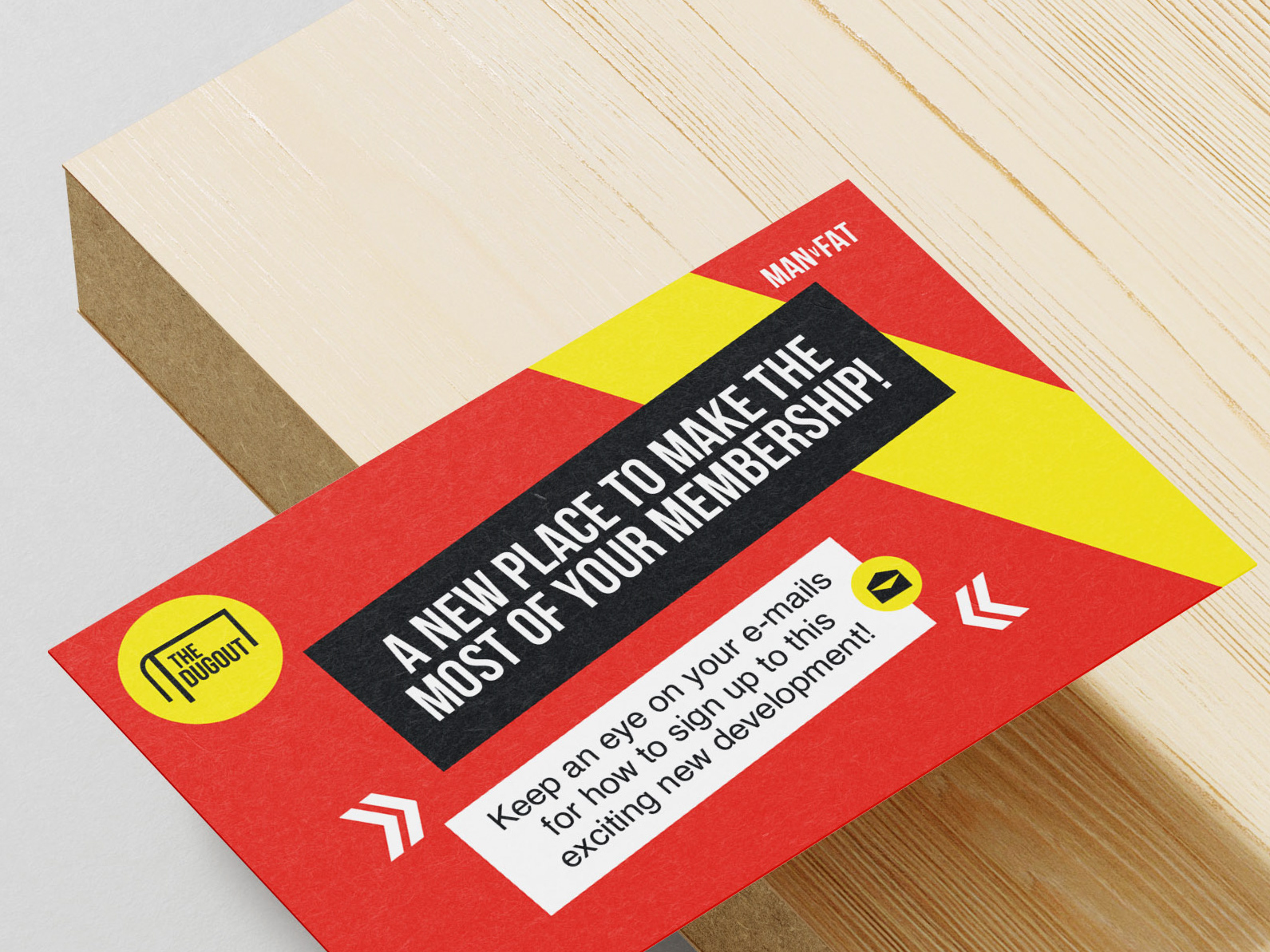
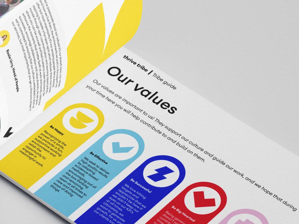
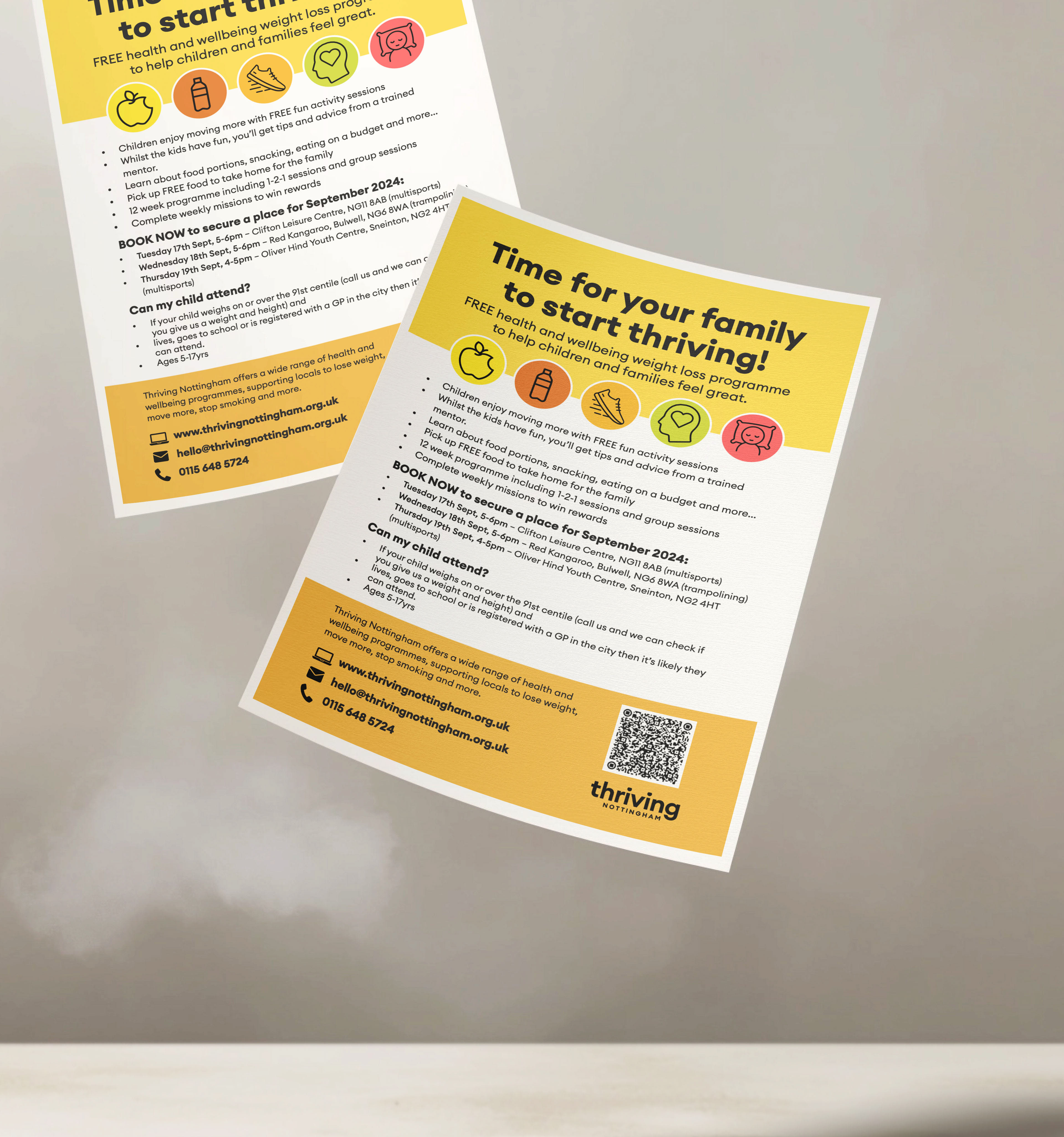
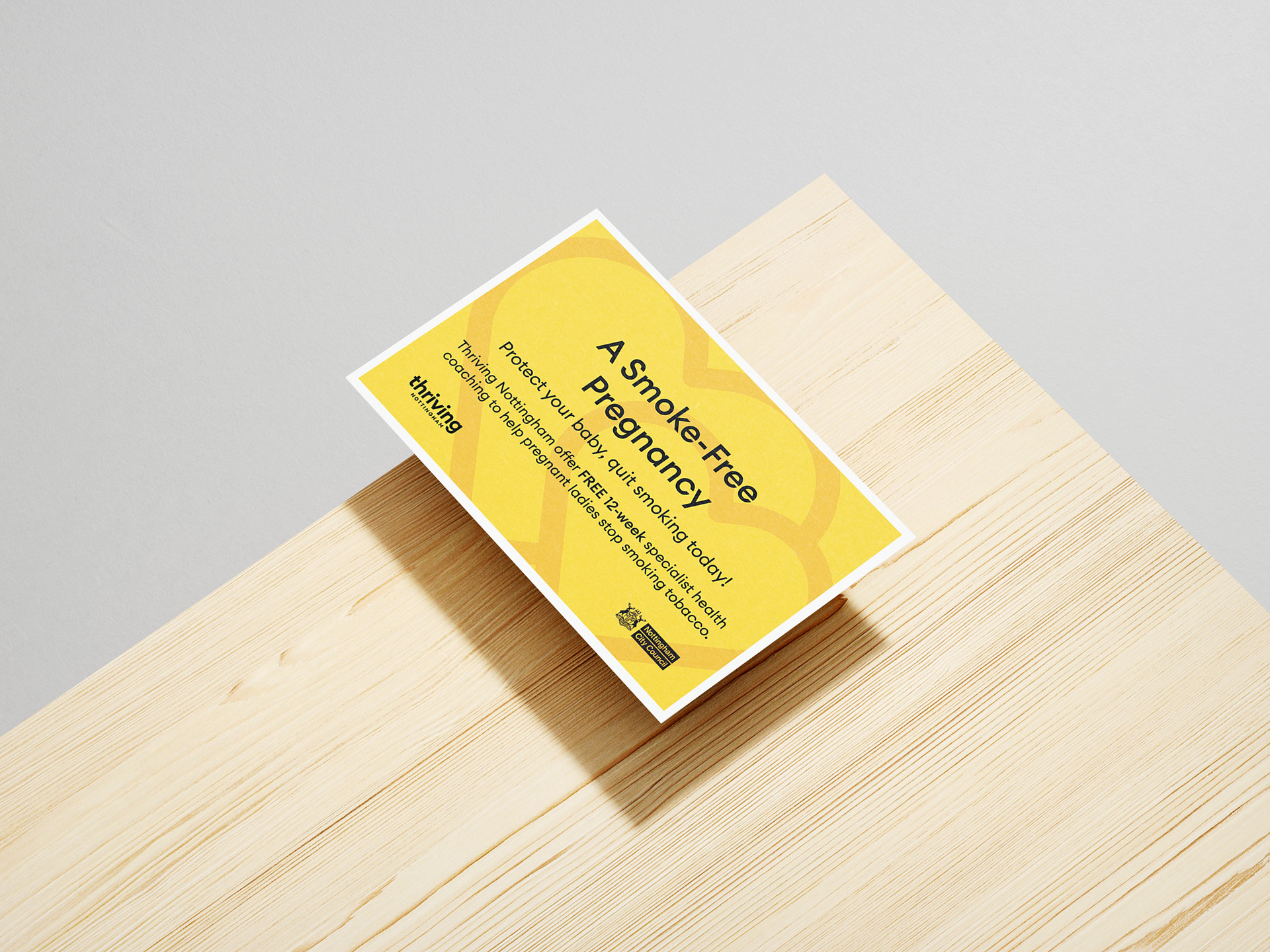
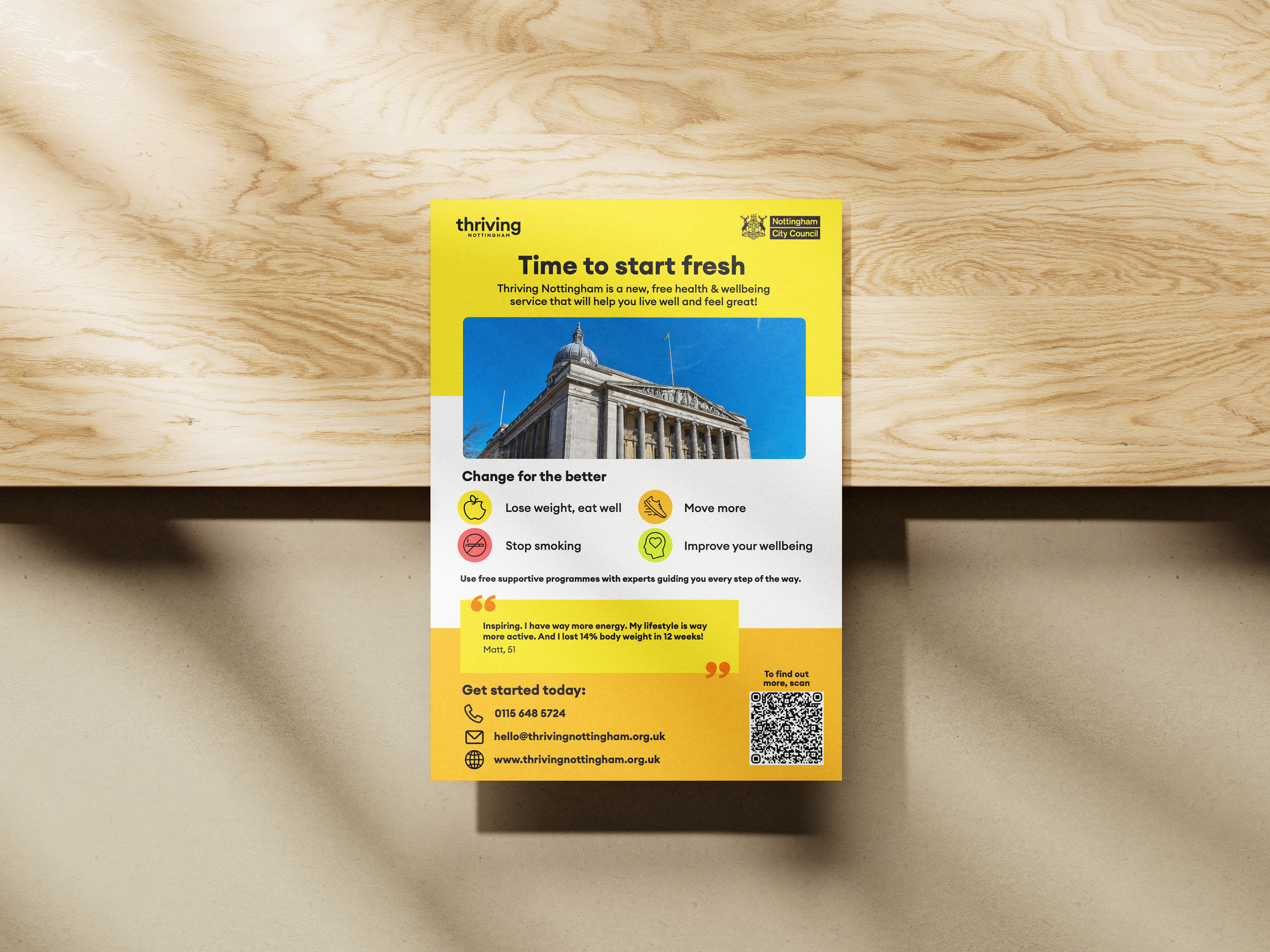
Brand Assets Creation: Designing visual elements such as icons, typography, and marketing materials to maintain brand consistency across all platforms.
Challenges & Approach
One of the key challenges was creating a brand identity that appealed to a diverse audience while maintaining a professional yet approachable tone. Through research and competitor analysis, I developed a design strategy that balanced warmth and credibility, ensuring that the brand resonated with its target audience. The final brand design combines modern aesthetics with accessibility, ensuring clarity and inclusivity in all materials.



Outcome
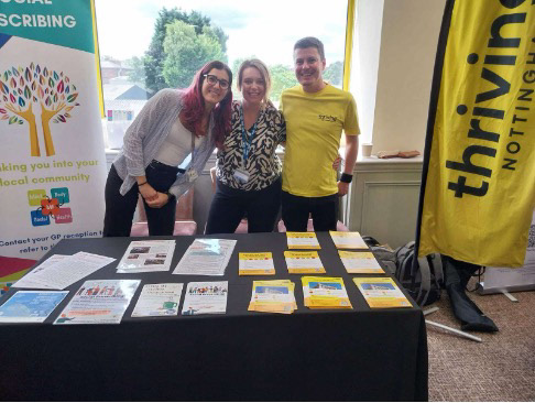
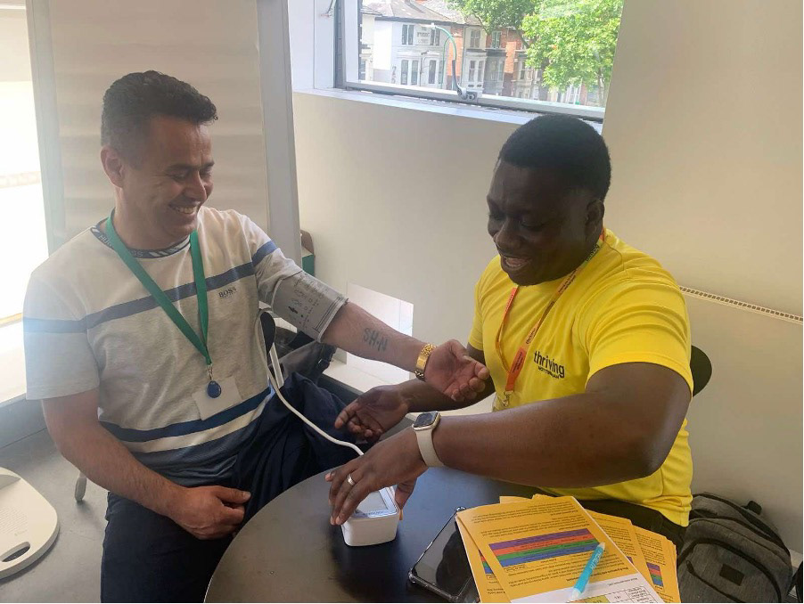
The final brand design for Thriving Nottingham successfully captures the essence of the service, providing a strong visual identity that enhances its presence in the health and wellbeing sector. The cohesive branding has been applied across digital and print materials, ensuring consistency and recognisability.


